Responsive Websites
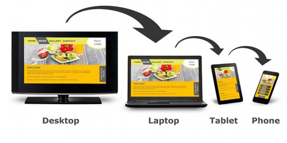
When we access a certain website through our phone, the website tends to distort in many ways and we are not really able to see what the content of the website is. Sometimes its all images and sometimes its all texts, this sometimes deteriorates the user experience and the user avoids visiting your website in the future. Responsive web design has become more crucial as the amount of mobile traffic now accounts for more than half of total internet traffic. Responsive web design is the perfect example of user interface plasticity.
Responsive Websites is an approach to web design elements that allow desktop webpages to be viewed in response to the size of the screen or web browser one is using. In addition, it’s important to understand that Responsive Web Design tasks include offering the same support to various types of devices for a single website.Where a website must be supportive of basic mobile devices that lack JavaScript, browser detection and mobile device detection, two ways of deducing if certain HTML and CSS features are supported. These methods are not fully reliable unless used in conjunction with a device capabilities database.
Responsive Web design is the phenomena that implies that design and development should respond to the user’s behavioral factors and environment based on screen size, platform and screen orientation. The concept consists of a combination of flexible grids and layouts, images and an intelligent use of CSS media methods. As the user switches from their laptop to iPad, the website should instantaneously switch to optimize for resolution, image size and scripting attributes. In other simple words, the website should have the technology to automatically respond to the user’s device preferences.
Responsive Websites with us!
At Crystal Web Techs, we provide the means for you to optimize your website so that it adapts to every other mobile device and does not distort with changes in the layout preference. Our team of individuals that are expert in web and graphic designing can easily make your website so that it can automatically adjust to any screen resolution and give you the best outcome with no error to look forward to. We are well-versed in the field of Responsive Websites and will help you get the best results according to your website. We will help you get responsive with all the devices out there.
Call us, Mail us or Visit us!